Exercises for Building Consumer Trust

An Open Letter to Managers: 6 Ways to Build Consumer Trust

Dear Managers:


You hold a lot of power. Use it wisely, or risk losing it altogether.


In an episode of everyone’s favorite guilty pleasure, “Game of Thrones,” dynamic Cersei Lannister issues a strong rebuttal to Littlefinger’s assertion that knowledge is power. Armed with men at her command who could kill Littlefinger quite easily, Cersei states instead that, “No… power is power.”


Who’s right?


Power typically boils down to one simple thing, and from a marketing standpoint, that one thing can make or break your credibility in an instant. It’s simple but monumental: perception.


How Do People See You?

Image is everything, right? Well, of course not, but in marketing, it’s huge. To sell items, you have to present them well. Think of supermodels like Christy Turlington and Josie Maran applying glossy argon oil serums to her flawless skin on QVC.


Image gets a customer’s attention, and that’s the critical first step. But what incites that first sale? And what keeps them coming back?


The Power and Psychology of Trust

Trust-based marketing is applauded for a reason – primarily because it works. Sure, certain marketing tactics might win an initial consumer, but disappointment in a lackluster product won’t retain sales. If you want your business to stay relevant, you must make sure that your trustworthiness remains intact. If severed, you’ve lost out on a bounty of future sales, because people appreciate the familiar.


Trust must be earned, and how you market your brand is going to either help or hurt your trustworthiness. Certain tactics can make a huge difference when it comes to growing a customer base.


  1. Admit your mistakes.

Learning how to market your items is sometimes a trial and error process, but  that’s a good thing. More often than not, we learn how to do something by first learning how not to do it. When something doesn’t fit a customer right or create the same results shown on an infomercial, acknowledge the customer’s experience without invalidating it in defense.


A bad review on your site is not a deal-breaker, and most people appreciate the honesty — especially when it’s followed by a sincere and helpful response from customer service. Transparency is a vital step to fostering continued relationships despite an initial roadblock.


  1. Entice first-time buyers with promotions.

Everyone loves a good deal, so give it to a newbie customer who might be on the fence about making their first purchases. A 20% coupon code is a great way to initiate this relationship. Many coupon code introductory offers expire quickly — set yourself apart by giving customers additional time if they’d like. Send out a personalized email reminder about their lingering and unused offer, and then ask them if they’d like more time or assistance from a customer service representative.


  1. Reward loyal customers.

Your tried and true customers are the heart of your sales, so treat them well. When building and nurturing this relationship, offer generous discounts and deals for their continued support. Birthday emails and coupon codes, special discounts for posting reviews, and gift card drawings for sharing personal product photos all help grow your business and keep customers happy. Social media is priceless advertising. Use it to your advantage.


  1. Embrace customer reviews.

Share every review you receive: the good, the bad and the so-so. Customers appreciate hearing from other people about how their experiences went, and great reviews only solidify your competence.


Don’t fear bad reviews.. Allow detailed reviews to appear alongside your item, and include that feedback as a whole on the product page. Does a certain shoe run a half size larger than the standard size 7? Have five reviewers mentioned this? Include that information at the top to make sure customers are fully informed with no surprises.


  1. Employ excellent return policies.

Sure, your product is so fantastic that no one would ever dream of returning it, right? Confidence in your product doesn’t mean ignorance of human nature. A customer might buy an item at Loft that doesn’t fit well. If they return the item and find the exact fit that works for their body in the process, you may have created a loyal Loft customer who trusts your company.  . So don’t knock a good return policy – one return can lead to a lifetime of sales.


  1. Focus on stellar customer service.

For Christmas last year, I ordered a pair of Ray-Ban sunglasses as a gift, only to learn that the sunglasses were never delivered to my home despite the post office saying otherwise. Luckily, I’d placed my order with Amazon, and the process went something like this:

  • I initiated a virtual chat with a customer service representative through
  • I explained the situation
  • She apologized for the lost item and immediately sent a new pair to me via overnight shipping – free of charge


The entire exchange lasted around two minutes. I was absolutely floored and incredibly appreciative. I didn’t have to jump through hoops or wait on hold for hours. Instead, the problem was immediately and professionally resolved. Consider having customer service that covers more than just a 1-800 number or email. Live chat support makes people feel more connected and comfortable making a purchase.


Building Long-Term Customer Trust

Building customer trust isn’t always easy. It takes time, costs money and requires a lot of extra effort. In the end, though, it’s worth it – and it might be the smartest business tactic any company could employ. Knowledge is power, as Littlefinger explained, so utilize these tips to help strengthen your customer’s perception of your trustworthiness. And don’t disappoint them, especially if their last names are Lannister.


Check out my friend Kayla’s blog if you’re looking for some great content!

Marketing Strategies: Appealing to Multiple Personalities

No two people are the same, so why should we market to them in the same way? Each customer has a specific set of desires, feelings, and interests that advertisements cannot accommodate like a “one size fits all” t-shirt.


By applying psychological research of different personality traits without the need for dual diagnosis, you can increase consumer output.


Five Factors of Personality


Psychological studies have shown that we possess about five different personality traits that make up who we are and define our actions. These categories are:


  • Extroverted: characterized by assertiveness, energy, and pleasure in the company of others


  • Agreeable: characterized by compassion, cooperation, and the ability to trust


  • Conscientious: characterized by self-discipline, achievement oriented, and organization


  • Emotional Stability: characterized by the ability or inability to remain calm, invulnerable, and relaxed


  • Intellectual (also referred to as openness): characterized by imagination, innovation, and curiosity


We exhibit certain behaviors more than others and are therefore more inclined to partake in something that matches our interests. For example, an intellectual may be drawn to bright, energetic colors, while a conscientious person is more impressed with how information is organized.


Personality can go deeper than the obvious marketing devices we use today, such as gender and cultural differences. Appealing to our inner profile establishes a sense of understanding and persuades us to purchase a product because the marketer “gets us” on a personal level.


Marketing strategies can be more effective by catering them according to what drives us and what we think will benefit our emotions, thoughts, and goals. Advertisements should recognize each of our wants and exploit them.


Three Ways to Change Your Marketing Strategy


How do you advertise your product to a personality trait? There a few ways to do so that are listed below.


#1: Read your audience


It is no secret by now that sites havesoftware they can use to track what you search or type and then pull up advertisements that grab your attention. This is a good example for what marketers can be doing to understand their audience and change their advertisements based on consumer behavior.


Even if you don’t have special software to filter through someone’s Facebook page or Twitter account, you can still observe their comments and reviews to figure out what kind of information they are looking for in your product. What changes do they want to see? What do their comments reveal about their personality? Then adjust accordingly.


Even as you are performing a presentation to new clients, observe their reactions as you present, and don’t be afraid to change your tone or content. Think of yourself as a lump of clay, and your audience does the shaping. You must be flexible and ready to meet their needs in order to sell a product.


#2: Produce motivational content


A study conducted in Psychological Science examined how personalized advertisements of the same phone appealed to different types of people. An ad catered towards extroverts highlighted the excitement of the new phone, while an ad for the emotionally unstable promoted its safety and security. Both proved to be effective when targeting their individual audiences.


Clearly an advertisement depicting excitement and going to parties would not work for introverts, and that personality type would have lost interest immediately. This is because we are all different. Not all advertisements can provide the same motivational tactics, especially for something as widely used as a phone.


To bring in all consumers, all the benefits of a product should be examined. It’s like when you’re tailoring a resume for a certain job. You’re showing what you have to offer someone and how you would benefit the company. What parts of your product would appeal most to an agreeable person, an intellectual?


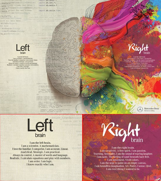
The Mercedes-Benz advertisement below is a smart example of an ad that appeals to multiple personalities.

left and Right Brain

There is an idea that we use either the left or right side of our brain, but Mercedes-Benz promises to use both for the best possible product. Consumers can appreciate the inclusion of different traits, especially with the use of first person.


We might look at the words, “I love the familiar. I categorize. I am accurate” or “I am creativity. A free spirit. I am passion” and say to ourselves, “Yes! That is me, exactly!” This ad is full of motivational content.


#3: Blend facts with imagery and layout


Different people like to see different things, so how can you possibly combine all of the attractive elements together? Simply do not restrict an advertisement to just one personality trait.


Flyers would be a good example of this. Their mission is to attract readers at first sight from the design and/or images, and if this task is complete, readers must be able to glance at the information and know the what, when, where, and why in a matter of seconds.


In such an advertisement, you might include attractive, original imagery that provokes and delights, appealing to extroverts and intellectuals. Cool colors might be used to appeal to emotional stability. Then set the facts or statistics up front and center for a conscientious person who just wants to get in and out or for an agreeable person who is looking to build trust.


The same tactic applies not just to flyers, but commercials, internet ads, and email messages. The more styling elements you combine and meet the motivational needs of consumers, the more personalities you will please. The important thing to remember is that it makes sense, like the Mercedes-Benz advertisement.


In conclusion, consumers like to feel as if companies know and care about them, and what better way to do this than by appealing to the core of what makes them who they are? By remembering the five personality traits when developing your marketing strategies, you can have a greater effect on your audience.


A Lesson in Behavioral Economics, Courtesy of Starbucks’ Trash

Behavioral economics play a huge role in the business and marketing world. Heuristics, framing and market inefficiencies are all extremely relevant – even today. Perhaps most interesting is the idea that our personal biases can help influence decisions and actions in our lives. This concept is called loss aversion.


Some may argue that the concept single-handedly decides how successful a business is. That is because most people tend to work much harder to avoid losses than they do to achieve personal gains. Even when losses are much fewer than gains, people still do their best to avoid them.


By keeping this concept in mind, you can ultimately influence the decisions your customers make and so much more. Starbucks and their paper cup dilemma is a perfect example of this.

Behavioral Economics and Starbucks

The infamous chain café, Starbucks, produces about 4 billion cups per year, regardless of market trends. Not only is that a lot of money going to waste, but it’s also not “green” or good for the environment.


In comparison, that number adds up to about 12 cups for every man, woman and child in the United States – all of them going to waste. Needless to say, Starbucks has a problem with their cups. The issue has escalated to a point where images have surfaced pointing out “branded trash,” which is another way of calling the company wasteful.

Starbucks Trash


The company has recently been working on a way to recycle these cups, or to implement some type of system where they can recoup their losses. Unfortunately, they don’t realize there’s a great way to do this – and they already have a system in place.


Currently, Starbucks offers customers a 10 cent discount if they bring their own mug. It doesn’t matter what beverage you decide to order, if you have your own mug, cup or container, you get ten cents off the total price. Starbucks reveals this information quite vaguely on their website:


Join the movement. Bring a reusable travel mug and get a 10 cent discount on any Starbucks beverage, anytime.

One person can save trees, together we can save forests


While this is a great plan, the company could actually see a greater effect if they flip-flopped the idea.


Make Customers Work Harder to Avoid Loss

It would make more sense for Starbucks to charge ten cents extra for all of the customers who do not have their own mug or cup. That doesn’t mean  they need to raise their prices ten cents, but  they simply need to discuss the idea differently.


For instance, let’s say the normal list price of a coffee is $1.70. Customers that bring their own mug or cup are instead charged $1.60. So what if they changed the list price of the drink to 1.60 instead? For everyone else that doesn’t bring their own cup, Starbucks could charge the normal price of $1.70, or ten cents extra.


In other words, they wouldn’t really be changing any of their prices — they would simply  be changing how customers look at them. Customers are more apt to avoid a loss and supply their own cups if they know they’re paying extra for a new one each time.


Of course, there are always buyers who don’t want to bother carrying around their own mug but that’s exactly why that extra charge exists – they don’t have to if they don’t want to.


Will This Will Work?

While Starbucks is struggling with their cup problem, this behavioral economics idea is already being used. In Prince George County Maryland, residents are  being charged a tax when they use plastic grocery bags. This has  encouraged customers to bring their own bags to avoid paying the associated fees.


Originally, customers were offered a five cent bonus for bringing their own reusable bags. However, the campaign didn’t perform as well as the district had hoped. Naturally, they flipped the idea and now impose a five cent tax on customers who ask for grocery bags. Needless to say, people don’t want to pay the tax, leading to a major reduction in the use of grocery bags in the district.


This all boils down to the concept of loss aversion in behavioral economics. The way people look at the cost, or the subjective value, is much greater when it’s coming out of their own pocket.


With the Starbucks example, the original plan makes customers feel like they are earning ten cents instead of losing it. With the flip-flopped example, it actually appears as if the ten cents are coming out of their pocket – resembling a loss. This encourages customers to avoid the loss even if it’s on an even keel with the original model.


How to Make This Concept Work for You

Personal bias and the way things appear equally affect decisions that your customers and employees are making. After all, there’s a valid reason that professional golfers perform much better when trying to save par as opposed to making a birdie.


The concept can directly influence investment behavior, advertising, marketing strategies, education campaigns, and much more. Most successful companies  employ the use of loss aversion, even if they don’t refer to the concept as that exactly.

Cashback Consumer Psychology


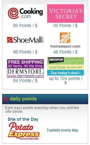
Try to remember that people tend to do anything to avoid a loss, and it goes both ways. From a business standpoint, that means you may be less likely to dump a risky investment, because it would mean admitting a loss. Look at each situation objectively, and decide the more beneficial route. When it comes to customers, use it to your advantage.  Offer sales items and coupons that help frame purchases as risk averse items.  Memolink’s cashback promos frame sale items not with a monetary value, but actually with points therefore taking any attention from the consumer away from a loss of money but more as an accumulation of points.  This gamified strategy is very effective in making something risk averse customers try to avoid, into something they feel they are benefiting from…winning points.


In the case of Starbucks, the company is too worried about how customers might react if they change policy. Jim Hanna, environmental impact for Starbucks said “it comes down to the relationship that we’ve built with our customers over the past 40 years.”  They don’t want to risk irritating customers who would have to pay the extra ten cents for a cup.


In other words, Starbucks seems to be more worried about the loss than the gains they could experience. As a result,  it’s making them avoid the risk altogether. Avoid falling into the same trap yourself, at all costs.

Web Design for the Way Consumers Think

Content is king.


This phrase has shown up on web marketing and social media blogs everywhere over the last couple of years. But what should really be said is: well-designed content is king.


What are your customers thinking when they visit your website? Can they find the information they’re looking for, or are they leaving? Are they distracted by too much content?


Even the most beautiful website will repel visitors if it isn’t functional. And tons of content and multi-media has no purpose unless it’s presented in an attractive way. A well thought-out design can increase your sales, as well as your customer base — let’s take a look at the power of visual context


Keep Options Limited


Imagine shopping at any department store or big box retailer. The options seem limitless, and so many items can easily distract you. If you’re casually shopping around, this might be fine. But if you’re on a mission for one particular item or in a hurry, a department store is the worst place you could be.


Your website isn’t a department store, and most customers are visiting your website with a goal in mind. Visitors are either looking for information on a product or service, or they’re wanting to make a quick purchase. Having too many options presented can frustrate customers and cause them to run away.


Inspired Mag cites a study by Sheeya Iyengar that gives valuable insight on consumer behavior based on different option amounts. In the study, Iyengar set up a jam display at an upscale grocery store. One Saturday she offered 24 flavors. On another Saturday she offered only six. On which day do you think she sold more jam?


If you guessed she sold more on the day she offered 24 flavors, you’d be wrong.


As it turns out, limiting options helps customers make quicker decisions before they become frustrated with the process of deciding.  Your website should mostly stick to having  main categories of content on your homepage, presented neatly and accessibly.

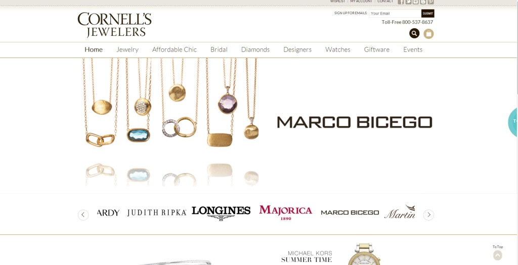
Let’s examine two approaches.  Cornell Jeweler’s offer a simple design that maximizes the use of white space.  But their greatest challenge in design is not the ability to focus on products here, but actually to take quick action on any one product.  Instead of highlighting individual products for fast sales, the brand is using all of the information above the fold to highlight the brands they carry.  While Cornell Jewelers may have some frequent clientele, due to the nature of their industry, most shoppers are visiting for special occasion gifts.   In fact, jewelry shopping continues to decline rapidly with the aging of the Generation Y’ers and the New Millenials.  Therefore they are not likely to be familiar with the many brands, and as a result care much less about the brands carried compared to the actual look of the product they want to buy.

Cornell Jeweler’s would be likely benefit by using that prime “above the fold” real estate to actually showcase some products with action calls to visit the product page.

Cornells Jewelers Home


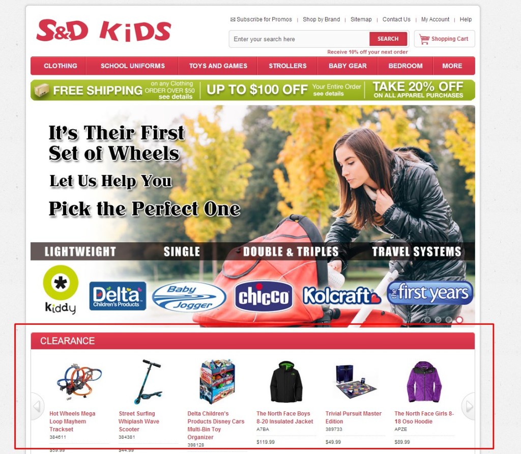
Compare this home page to that for S & D Kids Clothing.  Their homepage takes a similar approach towards illustrating the brands carried by the uniform wholesaler.  However, S & D reports significantly higher conversion rates (Sorry, I am not taking into account industry in this) due to massive success with their clearance items.  Therefore it should come as no surprise that these successful clearance items are present in prime home page real estate above the fold.

S & D Kids

Modern consumers hate being sold to, but being vague about your ultimate goal isn’t the answer.


Consumers respond to bold content, such as large headers and call-to-action buttons. It’s easy and possible to let your customers know what you want from them without writing 400 words about why they should buy your product.


Website visitors also have a short attention span — about  8 seconds according to Statistic Brain. Let them know what you’re hoping for, quickly. Lay out your call-to-action buttons and headlines first, and then design the rest of your content and images around them.


Make Your Pictures Worth 1,000 Words


Humans are visual creatures and good at relating words and images and discovering patterns. That’s why telling your story with images works better than writing an essay. Images have a way of driving home a point that words can’t always do alone.


Show Your Customers Progress


If you’ve managed to get your customer all the way to check out, you can still use design in this arena, as well, to avoid cart abandonment.


This infographic by Visual.ly shows that a total of 39% of people abandon their carts due to lengthy checkout processes, such as registering for an account before checking out.


One effective checkout process design feature is a progress bar, showing customers how far along they are. Impatient shoppers despise the registration process required to check out as a new customer, but if they know upfront that checkout will only be a three- or four-step process, they’ll be more likely to complete the transaction.


Use Line of Sight to Guide Visitors

Human brains are easily persuaded by what they see. In fact, we process visual information faster than we can even think about it.


We love to see big, bold attractive faces. And when those faces are looking at your sign up form, guess where visitors are looking as well? That’s right –your sign up form!


This article by Inspired Mag cites Giovanni Galfano’s study on human reactions to gazes. The same study concludes that we react to arrows in the same manner. If there are features on your website you want to grab your visitors’ attention, consider using visual elements to direct them.


When it comes to building a website, you can’t ignore design. Not only are consumers persuaded by design more than context, but strategic designs and layouts can actually convert visitors to sales.